What is Bootstrap? How to use the bootstrap in ASP.NET MVC 5?
Example Bootstrap: https://drive.google.com/file/d/1t2ozLWf9RufA3a4cwmxWNMpoWA6qZ92V/view?usp=sharing
Bootstrap is CSS Framework with 99% of CSS and 1% of java script used to design mobile first web applications or websites. It is small fast CSS Framework with complete set of functionalities to design mobile first web applications. It was product of twitter and now open source.
Why Bootstrap?
- Small, fast , easy to design and development.
- Follows single responsibility principal feature.
- Allow you design development mobile first websites.
- Complete set of CSS which needed for design and development.
- Bootstrap also gives you the ability to easily create responsive designs.
- Bootstrap 4 is compatible with all modern browsers (Chrome, Firefox, Internet Explorer 10+, Edge, Safari, and Opera).
- Open Source, Save Lots of Time, Compatible with modern browser.
How to use the Bootstrap in a ASP.NET MVC or HTML Page?
To use the bootstrap you can download the bootstrap from the website GetBootstrap.com but if ASP.NET MVC 5 has built in css and js files in content and script folder so you do not need to download it. You can inclue it in your page or view as follows –
<head>
    <meta name="viewport" content="width=device-width" />
    <title>TypoGraphy</title>
    <link href="~/Content/bootstrap.css" rel="stylesheet" />
    <script src="~/Scripts/bootstrap.js"></script>
</head>
Bootstrap Grid System
Bootstrap grid system provides the quick and convenient way to create responsive website layouts. In Grid System bootstrap divide the width of the device into rows and columns where every row will have 12 logical units or columns where from you can occupy any specified number of columns as per your requirements.

To work with grid we need following classes or concepts –
- Container or Container-Fluid
- Rows
- Columns
Container / Container-Fluid in Bootstrap
Containers are the most basic layout element in Bootstrap and are required when using the grid system. Containers are basically used to wrap content with some padding. They are also used to align the content horizontally center on the page in case of fixed width layout.
Bootstrap provides three different types containers:
.container, which has a max-width at each responsive breakpoint.
.container-fluid, which has 100% width at all breakpoints.
You can use it as follows –
<div class="container">

<div>
<div class="container-fluid">
</div>row Class:
row class can be used to create a row in container and you can create a multiple rows in one container class. You can use row class as follows –
<div class="container">
  <div class="row">

  </div>
  <div class="row">
  </div>
</div>
col Class: –
col class can be used to create the column in row or it allow you to occupy the specified no of columns or logical units from the row. It can be used as follows-
<div class="col-md/sm/xs/lg-no"> </div>Where –
xs : – is used for device whose width is < 576px e.g. phones
sm : – is used for device whose width is ≥576px e.g. tab
md : – is used for device whose width is ≥768px e.g. medium desktop
lg : – is used for device whose width is ≥992px e.g. large desktop
no – specify how many unit you want to allocate e.g. 1,2,3,4,5,6,7,8,9,10,11,12
e.g. if you want to allocate 4 logical unit in medium desktop you can do it as follows –
col-md-4 :- will occupy the four logical units from the row for medium size desktop.
Rules for the Grid System
- Rows must be placed within a .container (fixed-width) or .container-fluid (full-width) for proper alignment and padding
- Use rows to create horizontal groups of columns
- Content should be placed within columns, and only columns may be immediate children of rows
- Grid columns are created by specifying the number of 12 available columns you wish to span. For example, three equal columns would use three .col-sm-4
Now Create the following UI using bootstrap –
- Create ASP.NET MVC 5 application using regular steps.
- Create the Test controller with index action and index view with following view in Index.cshtml
@{
    Layout = null;
}
<!DOCTYPE html>
<html>
<head>
    <meta name="viewport" content="width=device-width" />
    <title>TypoGraphy</title>
    <link href="~/Content/bootstrap.css" rel="stylesheet" />
    <script src="~/Scripts/bootstrap.js"></script>
</head>
<body>
  <div class="container">
      <div class="row">
         <div class="col-md-12">
             <span class="lead"> This is important text. </span>
             <br />
             <span class="text-danger"> First Line </span> <br />
             <span class="text-success"> First Line </span> <br />
             <span class="text-primary"> First Line </span> <br />
             <span class="text-info"> First Line </span> <br />
             <span class="text-muted"> First Line </span> <br />
             <span class="text-warning"> First Line </span> <br />
             <span class="label-danger"> First Line </span> <br />
             <span class="label-success"> First Line </span> <br />
             <span class="label-primary"> First Line </span> <br />
             <span class="label-info"> First Line </span> <br />
            <span class="label-warning"> First Line </span> <br />
            <span class="alert-danger"> First Line </span> <br />
            <span class="alert-success"> First Line </span> <br />
            <span class="alert-info"> First Line </span> <br />
            <span class="alert-warning"> First Line </span> <br />
                 US annouced <span class="badge">22 tri dollars</span> to invest in infrastructure
                 and in us instructure means <span class="badge">78%</span>, secondly mini wages are also incresed
                 by us goverment which leads in maximum outsourcing of it projects
                 to countires like to india, we will have huge job openings in
                 near features in IT.
             </div>
         </div>
    </div>
</body>
</html>
Few more classes –
hidden-sm, hidden-xs:- these classes will hide the elements or tags when device width is sm and xs, we can apply some logic and implement the responsive ness as follows –
Create a action with name Responsive as follows –
public ActionResult Responsive()
{
return View();
}
Write view code as follows –
@{
Layout = null;
}
<!DOCTYPE html>
<html>
<head>
<meta name="viewport" content="width=device-width" />
<title>Responsive</title>
<link href="~/Content/bootstrap.css" rel="stylesheet" />
<script src="~/Scripts/bootstrap.js"></script>
<style type="text/css">
.box {
border:1px solid blue;
}
</style>
</head>
<body>
<div class="container">
<div class="row">
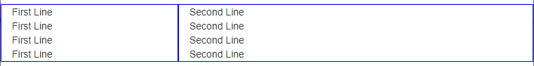
<div class="col-md-4 box hidden-sm col-xs-4">
First Line <br />
First Line <br />
First Line <br />
First Line <br />
</div>
<div class="col-md-4 box col-sm-6 col-xs-8">
Second Line <br />
Second Line <br />
Second Line <br />
Second Line <br />
</div>
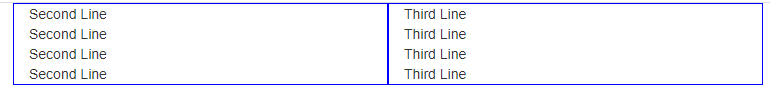
<div class="col-md-4 box col-sm-6 hidden-xs">
Third Line <br />
Third Line <br />
Third Line <br />
Third Line <br />
</div>
</div>
</div>
</body>
</html>
Explanation: –
<div class=”col-md-4 box hidden-sm col-xs-4″>
It will show this div in medium size desktop and hide this div in small size device and in extra small it will be of size 4 logical units.
<div class=”col-md-4 box col-sm-6 col-xs-8″>
It will show this div in medium size desktop with size 4 and in small size desktop with size of 6 and extra small with size of 8.
<div class=”col-md-4 box col-sm-6 hidden-xs”>
It will show this div in medium size desktop with size 4 and in small size it will be of size 6 and when size is extra small it will be hidden.
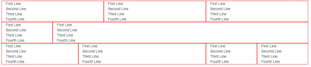
In medium size desktop it will be show as follows –

In small size desktop it will be show as follows –
On extra small size device it shows as follows –