Typography, Buttons , Lists ,Glyph icons and images in Bootstrap
Example Code Link : https://drive.google.com/file/d/1yWJTO_bvgWMWhRPjRQ17MBFy7t4GQOh8/view?usp=sharing
In this article we will learn about the various bootstrap classes for text, images , lists etc.
Typography Classes
Typography means text formatting. Bootstrap provides you wide range of the typography classes few of them are –
.lead Makes a paragraph stand out
.small Indicates smaller text (set to 85% of the size of the parent)
.text-left Indicates left-aligned text
.text-center Indicates center-aligned text
.text-right Indicates right-aligned text
.text-lowercase Indicates lowercased text
.text-uppercase Indicates uppercased text
.text-primary text with blue fore color
.text-danger text with red fore color
.text-success text with green fore color
.text-info text with light blue fore color
.text-warning text with yellow fore color
.label-primary text with blue background color
.label-danger text with red background color
.label-success text with green background color
.label-info text with light blue background color
.label-warning text with yellow background color
.alert-primary Blue alert. Indicates an important action
.alert-danger Red alert. Indicates a dangerous or potentially negative action
.alert-success Green alert. Indicates a successful or positive action
.alert-info Light-blue alert. Indicates a neutral informative change or action
.alert-warning Yellow alert. Indicates caution should be taken with this action
Button Classes
You can use btn class on anchor tag, input type button, reset, submit to convert it into bootstrap button. Use the following classes to achieve the different button styles:
- .btn-primary
- .btn-success
- .btn-info
- .btn-warning
- .btn-danger
- .btn-link
.btn-primary
The “primary” class can be used to provide more visual weight to a button while representing a primary action for visitors to take on the page. It will create the blue button.
.btn-success
The “success” class can be used to indicate a successful or positive action. It will create the greenish button (green button).
.btn-danger
The “danger” class can be used to indicate a potentially dangerous or negative action. It will create the radish button (red button).
.btn-warning
Similarly, the “warning” class can represent a warning. Orange colored button
.btn-info
The “info” class can represent an informational alert.Skyblue button.
.btn-link
You can use the “link” class if you’re looking to deemphasize the appearance of a button. It will create a button with hyper link (anchor).
  <button type="button" class="btn btn-primary">Primary</button>
  <button type="button" class="btn btn-success">Success</button>
  <button type="button" class="btn btn-danger">Danger</button>
  <button type="button" class="btn btn-warning">Warning</button>
  <button type="button" class="btn btn-info">Info</button>
  <button type="button" class="btn btn-link">Link</button>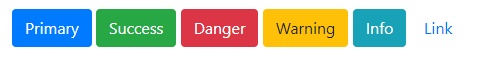
Bootstrap Button Size
In Bootstrap, you can choose a button according to your requirement. It provides four button sizes.
The following classes define the different sizes:
- .btn-lg
- .btn-md
- .btn-sm
- .btn-xs
<button type="button" class="btn btn-primary btn-lg">Large Button</button>

<button type="button" class="btn btn-primary">Default Button</button>
<button type="button" class="btn btn-primary btn-sm">Small Button</button>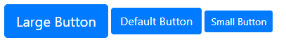
Button Groups
To create a button groups just wrap a series of buttons with .btn class in a element and apply the class .btn-group on it, as demonstrated in the following example:
<div class="btn-group">
   <button type="button" class="btn btn-primary">Home</button>
   <button type="button" class="btn btn-primary">About</button>
   <button type="button" class="btn btn-primary">Services</button>
</div>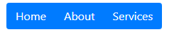
If you want to create vertical button group you can create it as follows –
<div class="btn-group-vertical">
  <button type="button" class="btn btn-primary">Home</button>
  <button type="button" class="btn btn-primary">About</button>
   <button type="button" class="btn btn-primary">Services</button>
 </div>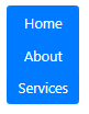
List Classes
Bootstrap also provides you list classes those can be used to manipulate and display the lists.
list-unstyled: – it will remove the styling of list.
list-inline:- will display the list in one line (try to display all the items in same line)
List without boot strap classes –
<ul>
<li>First Element </li>
<li>Second Element </li>
<li>Third Element </li>
<li>Fourth Element </li>
</ul>
UL List with bootstrap class list-unstyled and list-inline
<ul class="list-unstyled list-inline">
   <li>C#</li>
   <li>VB</li>
   <li>F#</li>
   <li>Q#</li>
   <li>VJ#</li>
 </ul>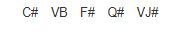
List Group classes
<ul class="list-group">
    <li class="list-group-item list-group-item-danger">C#</li>
    <li class="list-group-item list-group-item-success">VB</li>
    <li class="list-group-item list-group-item-info">F#</li>
    <li class="list-group-item">Q#</li>
    <li class="list-group-item">VJ#</li>
</ul>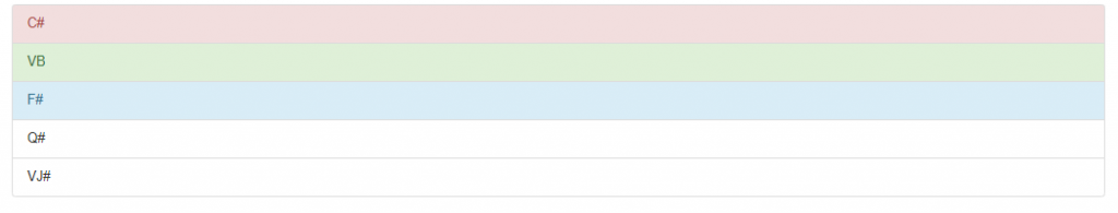
Glyphicons
Bootstrap has huge built in glyphicons those can be used in website to show various icons like mobile phone, land line phone, brief case, barcode and various arrows etc. To apply the glyphicon class first and then apply specific glyphicon-iconname class we need to do it as follows –
<tagname class=”glyphicon glyphicon-name”> </tagname>
Few Examples of Glyphicons with output –
 <div class="col-md-12">
      Please contact on <span class="glyphicon glyphicon-phone"></span> 79798897 for bar code <span class="glyphicon glyphicon-barcode"></span>.
                <br />
 <span class="glyphicon glyphicon-apple"></span> <br />
 <span class="glyphicon glyphicon-circle-arrow-up"></span> <br />
 <span class="glyphicon glyphicon-briefcase"></span> <br />
 <span class="glyphicon glyphicon-dashboard"></span> <br />
</div>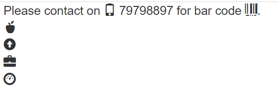
Image Classes
Bootstrap also provides you the classes those can be used to add some effect to images those are –
- .img-rounded
- .img-circle
- .img-thumbnail
- .img-responsive
Rounded Corners
The .img-rounded class adds rounded corners to an image (IE8 does not support rounded corners):
<img src="~/images/dom.jpg" class="img-rounded" />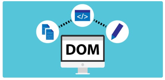
Circle
The .img-circle class shapes the image to a circle (IE8 does not support rounded corners):
<img src="~/images/dom.jpg" class="img-circle" />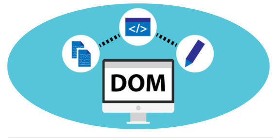
Thumbnail
The .img-thumbnail class shapes the image to a thumbnail:
<img src="~/images/dom.jpg" class="img-thumbnail" />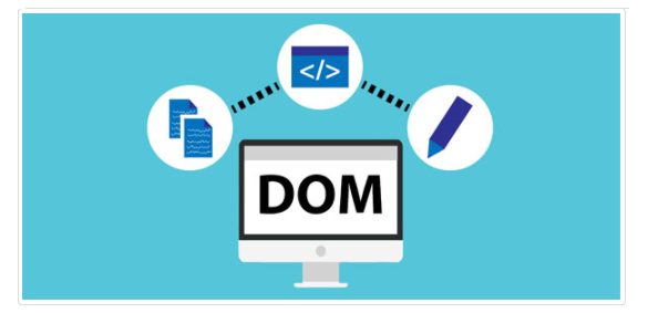
Responsive Images
Images come in all sizes. So do screens. Responsive images automatically adjust to fit the size of the screen.
Create responsive images by adding an .img-responsive class to the tag. The image will then scale nicely to the parent element.
The .img-responsive class applies display: block; and max-width: 100%; and height: auto; to the image:
<img src="~/images/AngularReact.jpg" class="img-responsive" />