Bootstrap Components

Bootstrap has many built in controls few of them we are going to discussion in this session.
Jumbotron:
A jumbotron indicates a big box for calling extra attention to some special content or information. A jumbotron is displayed as a grey box with rounded corners. It also enlarges the font sizes of the text inside it.Inside a jumbotron you can put nearly any valid HTML, including other Bootstrap elements/classes.
Use a element with class .jumbotron to create a jumbotron:
<div class="row">
 <div class="col-md-12">
      <div class="jumbotron">
          <h1> First Heading </h1>
                <p> This is content of first heading </p>
            </div>
     </div>
</div>
Pagination
Bootstrap allow you to convert any html list to a bootstrap pagination control as follows –
<ul class="pagination">
  <li><a href="">First</a></li>
  <li><a href="">First</a></li>
  <li><a href="">First</a></li>
  <li><a href="">First</a></li>
  <li><a href="">First</a></li>
  <li><a href="">First</a></li>
</ul>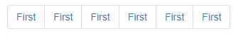
Bredcrumb
Similar to pagination control we can also convert the ul or ol lists to the bredcrumb bootstrap component –
 <ul class="breadcrumb">
   <li><a href="">First</a></li>
   <li><a href="">First</a></li>
   <li><a href="">First</a></li>
   <li><a href="">First</a></li>
   <li><a href="">First</a></li>
   <li><a href="">First</a></li>
</ul>
Well
Similar to pagination and bredcrumb you can also create a well component, well generate a rounded corner box which will have content.
<div class="well">
 this is div used to demo <br />
 this is div used to demo <br />
 this is div used to demo <br />
 this is div used to demo <br />
 this is div used to demo <br />
 this is div used to demo <br />
</div>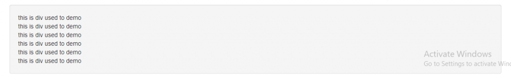
Collapsible
Collapsibles are useful when you want to hide and show large amount of content. This control will help you to expand and collapse the large content on the click of some button or other thing.
<div class="row">
             <div class="col-md-12">
                   <a class="btn btn-danger" data-toggle="collapse" data-target="#dv">Click <span class="caret"></span></a>
                   <div id="dv" class="collapse well">
                       <p>
       this is content of collapsible tag used to demo. <br />
       this is content of collapsible tag used to demo. <br />
      this is content of collapsible tag used to demo. <br />
      this is content of collapsible tag used to demo. <br />
      this is content of collapsible tag used to demo. <br />
      this is content of collapsible tag used to demo. <br />
      this is content of collapsible tag used to demo. <br />
      this is content of collapsible tag used to demo. <br />
                       </p>
                   </div>
             </div>
        </div>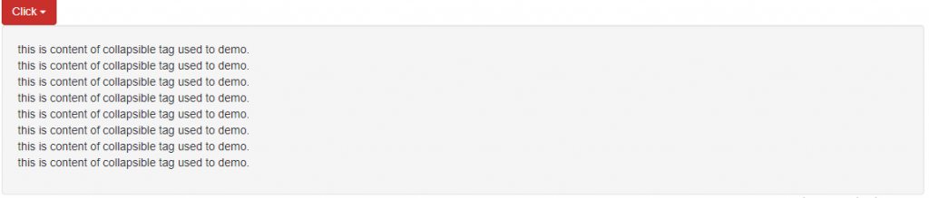
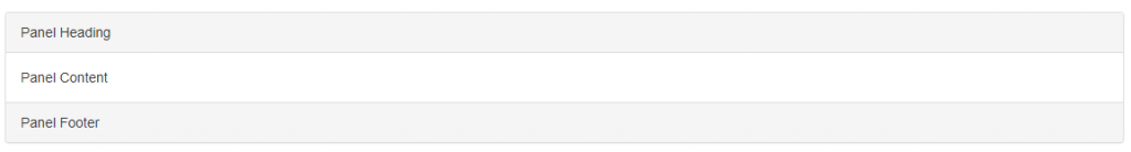
Panel
A panel in bootstrap is a bordered box with some padding around its content:
Panels are created with the .panel class, and content inside the panel has a .panel-body class:
<div class="panel panel-default">
  <div class="panel-body">A Basic Panel</div>
</div>
Panel Heading
The .panel-heading class adds a heading to the panel:
<div class="panel panel-default">
  <div class="panel-heading">Panel Heading</div>
  <div class="panel-body">Panel Content</div>
</div>
Panel Footer
The .panel-footer class adds a footer to the panel:
<div class="panel panel-default">
  <div class="panel-body">Panel Content</div>
  <div class="panel panel-default">
    <div class="panel-heading">Panel Heading</div>
    <div class="panel-body">Panel Content</div>
    <div class="panel-footer">Panel Footer</div>
  </div>
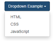
Dropdownlist
A dropdown menu is a toggleable menu that allows the user to choose one value from a predefined list:
<div class="dropdown">
  <button class="btn btn-primary dropdown-toggle" type="button" data-toggle="dropdown">Dropdown Example
  <span class="caret"></span></button>
  <ul class="dropdown-menu">
    <li><a href="#">HTML</a></li>
    <li><a href="#">CSS</a></li>
    <li><a href="#">JavaScript</a></li>
  </ul>
</div>
Example Explained
The .dropdown class indicates a dropdown menu.
To open the dropdown menu, use a button or a link with a class of .dropdown-toggle and the data-toggle=”dropdown” attribute.
The .caret class creates a caret arrow icon (), which indicates that the button is a dropdown.
Add the .dropdown-menu class to a ul element to actually build the dropdown menu.
Navbar in Bootstrap (Menu)
To create navbar in bootstrap we need to use follow –
- create div or nav tag which will act as container for navbar.
- apply a class navbar and navbar-default/navbar-inverse etc.
<nav class="navbar navbar-default">
 ...
</nav>
- You can add the brand name or logo in navbar for this use a anchor tag or image with a class navbar-brand
<a class="navbar-brand" href="#">Logo</a>
4. You can create nav element group using ul tag with a class nav and navbar-nav/nav-pills/nav-tabs and li elements with anchor tag as follows –
<ul class="nav navbar-nav">
    <li>
      <a href="#">Link 1</a>
    </li>
    <li>
      <a href="#">Link 2</a>
    </li>
    <li>
      <a href="#">Link 3</a>
    </li>
  </ul>
5.You can also create dropdown menu using previous example
6.You can fix the navbar on the top of page or bottom of the page using
navbar-fixed-top and navbar-fixed-bottom classes
<nav class="navbar navbar-inverse navbar-fixed-bottom">
  ...
</nav>